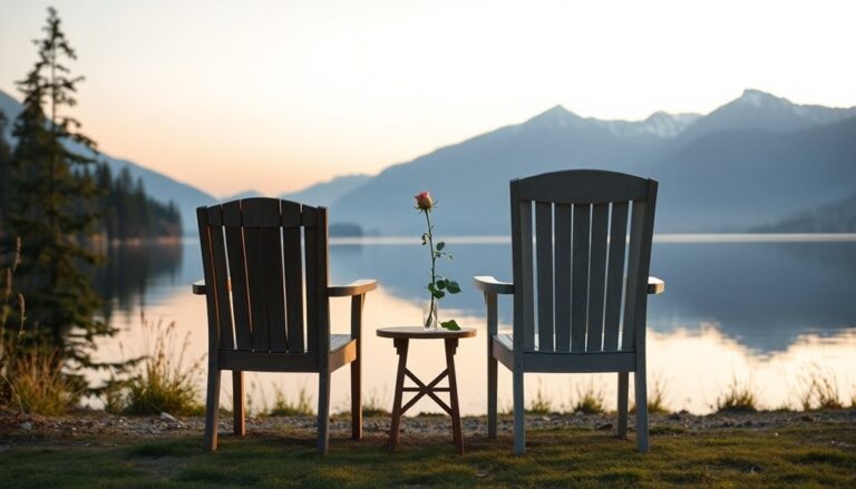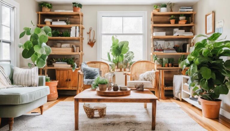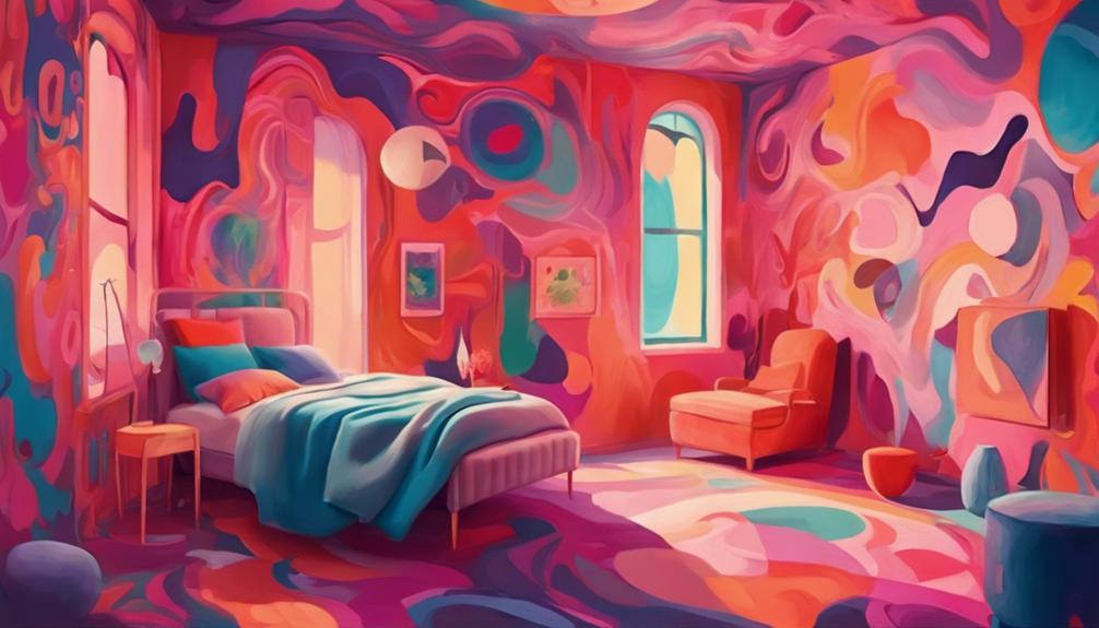
When we're choosing paint colors, we think about the mood we want to create in each space. For relaxation, we opt for calming colors like soft blues and muted greens. To boost energy, we pick vibrant hues like citrus-inspired shades and revitalizing blues. In formal rooms, we opt for sophisticated shades like rich neutrals and elegant accent walls. But what about creating spaces for creativity, playfulness, or luxury? We'll explore these options and more to find the perfect colors for every mood – and by doing so, uncover the secrets to designing atmospheres that inspire and uplift.
Calming Colors for Relaxation Spaces
When creating relaxation spaces, we are aware that calming colors promote serenity and tranquility, and soft blues like sky blue or light azure are often our go-to choices. These soothing hues have a way of calming our minds and bodies, making them perfect for bedrooms, meditation rooms, or reading nooks. These gentle blues can help reduce stress and anxiety, creating an atmosphere that's conducive to relaxation and rejuvenation.
But blues aren't the only calming colors we utilize. We also enjoy using muted greens, like sage or moss, which bring a sense of balance and harmony to a space. These earthy tones can help us feel more grounded and connected to nature, making them ideal for spaces where we want to unwind and recharge.
When selecting calming colors, we take into consideration the lighting in the space as well. Soft, warm lighting can enhance the calming effects of these colors, creating a cozy and inviting atmosphere. We'll often pair our calming colors with natural textures, like wood or stone, to create a sense of warmth and comfort.
Energizing Hues for Active Areas
As we move into the more energetic areas of our homes, we're looking for hues that'll get us pumped up and ready to take on the day. We want to surround ourselves with colors that'll boost our morning energy and turn our workspaces into vibrant hubs of productivity. Let's explore the energizing hues that'll get our hearts racing and our minds buzzing!
Boost Morning Energy
We kick-start our day in high gear with vibrant hues that electrify our morning routines. To boost our morning energy, we opt for paint colors that invigorate our senses and get us moving. Citrus-inspired shades like orange and yellow are perfect for kitchens and breakfast nooks, as they evoke feelings of warmth and excitement. These invigorating hues get our hearts racing and our minds buzzing, making them ideal for high-traffic areas where we start our day.
In our bathrooms, we choose revitalizing blues and greens to create an invigorating ambiance that awakens our senses. These stimulating yet energizing shades help us shake off the sleep and get ready to take on the day. For our bedrooms, we select vibrant corals and pinks that promote a sense of excitement and positivity, making it easier to jump out of bed and start our morning routine. By incorporating these energizing hues into our daily spaces, we set ourselves up for a day filled with vitality and enthusiasm.
Vibrant Workspace Vibes
Most of our waking hours are spent in active areas, where energizing hues can amplify our focus and productivity. We've all been there – staring blankly at a screen, struggling to stay motivated. That's where vibrant workspace vibes come in. By incorporating bold, stimulating colors into our workspaces, we can boost our energy and stay engaged. Think citrusy yellows, electric blues, and fiery oranges – these hues can't help but grab our attention and get those creative juices flowing.
We're not talking about overwhelming, neon-lit spaces, though. A balanced approach is key. We can introduce these energizing hues through accent walls, furniture, or even accessories. This way, we can create a workspace that's both stimulating and harmonious. When we're surrounded by colors that inspire us, we're more likely to stay motivated and focused. Plus, a vibrant workspace can be a great conversation starter, helping us connect with colleagues and friends. So, let's inject some vibrancy into our workspaces and watch our productivity soar!
Sophisticated Shades for Formal Rooms
As we consider the ambiance we want to create in our formal rooms, we're drawn to sophisticated shades that exude refinement and elegance. We're thinking of rich neutral tones that provide a classic backdrop for our most treasured possessions. By incorporating elegant accent walls, we can add depth and visual interest to these spaces.
Rich Neutral Tones
In formal rooms, rich neutral tones like warm beige, soft gray, and creamy white evoke a sense of sophistication and refinement. We love how these calming hues create a sense of serenity, perfect for formal gatherings or intimate dinner parties. These timeless shades also provide a beautiful backdrop for statement pieces, like ornate furniture or stunning artwork. When we choose rich neutral tones, we're not limited to a specific style or era, which makes them incredibly versatile.
We've found that warm beige adds a cozy touch to formal spaces, while soft gray brings a sense of modernity. Creamy white, on the other hand, adds a touch of elegance and sophistication. These shades work beautifully together, allowing us to create a harmonious and inviting atmosphere. By selecting rich neutral tones, we can create a sophisticated space that's perfect for special occasions or everyday living. Whether we're entertaining guests or enjoying a quiet evening, these shades help us feel connected and at ease in our own homes.
Elegant Accent Walls
We often use elegant accent walls to add a pop of sophistication to our formal rooms, and a rich, deep blue can instantly elevate the space to new heights. This bold, dramatic color creates a sense of luxury and refinement, making it perfect for formal living rooms, dining rooms, or even a sophisticated home office. To create a cohesive look, we like to pair our accent wall with neutral shades on adjacent walls, allowing the bold color to take center stage.
For a more subtle approach, we opt for softer, muted shades like mauve or dusty rose. These elegant hues add a touch of sophistication without overwhelming the space. Plus, they complement a variety of decorating styles, from traditional to modern. We've also found that adding metallic accents, like gold or silver, can enhance the elegance of our accent wall and create a cohesive, high-end look. By choosing the right shade, we can create a sophisticated atmosphere that makes our formal rooms feel truly special.
Nature-Inspired Colors for Serenity
Embracing earthy tones, we bring the calming essence of nature indoors, creating a serene atmosphere that soothes our minds and souls. By incorporating nature-inspired colors into our living spaces, we can create a sense of tranquility and connection to the natural world. These calming hues have a profound impact on our well-being, reducing stress and promoting relaxation.
Here are some of our favorite nature-inspired colors for serenity:
- Sage Green: A soft, muted green that evokes the calming essence of a forest glade.
- River Rock: A soothing gray-beige color that recalls the smooth stones found along a riverbank.
- Moss: A vibrant, yet calming green that brings to mind the lush, verdant growth of a forest floor.
- Driftwood: A weathered, gray-brown color that echoes the worn, smooth wood of a beachside driftwood find.
Bold Colors for Creative Expression
Vibrant hues ignite our imagination, sparking creativity and inspiring us to express ourselves boldly. When we surround ourselves with bold colors, we can't help but feel energized and motivated. These colors are perfect for creative spaces, studios, or home offices where we want to tap into our inner artist.
Bold colors can evoke a sense of playfulness and spontaneity, making them ideal for areas where we want to brainstorm, experiment, or explore new ideas. Here are some bold color options that can spark our creativity:
| Color | Mood | Inspiration |
|---|---|---|
| Cobalt Blue | Confident | Limitless possibilities |
| Vibrant Orange | Energetic | Spontaneous creativity |
| Electric Yellow | Optimistic | Sunshine-filled days |
| Deep Magenta | Passionate | Unbridled imagination |
When choosing bold colors for creative expression, consider the mood you want to evoke in the space. Do you want to feel energized and motivated, or do you want to tap into your playful and spontaneous side? By selecting the right bold color, we can create an environment that inspires us to think outside the box and bring our most innovative ideas to life. With bold colors, the possibilities are endless, and our imagination knows no bounds.
Warm Neutrals for Cozy Atmospheres
As we shift from energizing bold colors to calming hues, warm neutrals come into play, inviting us to create cozy atmospheres that soothe our minds and comfort our souls. We crave spaces that envelop us in tranquility, and warm neutrals deliver. These calming colors create an atmosphere that's both inviting and comforting, making them perfect for living rooms, bedrooms, and even home offices.
When choosing warm neutrals, we consider the following:
- Beige: A classic choice, beige brings a sense of calm and serenity to any room. It's also an excellent backdrop for adding pops of color through furniture and decor.
- Taupe: With its warm, earthy tone, taupe adds coziness to any space. It's ideal for creating a soothing ambiance in bedrooms or living rooms.
- Caramel: This rich, buttery shade exudes warmth and comfort. It's perfect for creating a welcoming atmosphere in entryways or dining rooms.
- Honey: With its soft, golden tone, honey adds a touch of warmth and sophistication to any room. It's an excellent choice for creating a cozy reading nook or home office.
Cool Pastels for Soft Ambiance
We often find ourselves drawn to cool pastels when we need a calming presence in our lives, and these soft hues never fail to create a serene ambiance that soothes our senses. There's something about the gentle, whisper-soft quality of these colors that instantly puts us at ease. Whether we're looking to create a peaceful retreat in our bedroom or a calming atmosphere in our living room, cool pastels are the perfect choice.
Soft blues, pale pinks, and misty lavenders are just a few of the colors that come to mind when we think of cool pastels. These hues are gentle and calming, making them ideal for creating a sense of relaxation and tranquility in any room. We love how they can add a touch of softness to our spaces without overwhelming our senses.
One of the best things about cool pastels is their versatility. We can use them as a dominant color or as an accent wall to add a pop of color to our space. They also pair beautifully with neutral shades like white, gray, and beige, making it easy to incorporate them into our existing decor. Whether we're looking to create a calming oasis or simply add a touch of serenity to our daily lives, cool pastels are the perfect choice.
Rich Jewel Tones for Luxury Feel
In contrast to the calming softness of cool pastels, rich jewel tones evoke a sense of luxury and sophistication, transporting us to a world of opulence and refinement. We’re drawn to these deep, vibrant hues because they speak to our desire for exclusivity and glamour. Rich jewel tones have a way of making us feel like we’re part of an elite group, like we’re in on a secret that only a select few get to experience. These sumptuous colors mirror the allure of hidden gems in real estate—rare, exquisite properties that exude charm and exclusivity. Just as a deep sapphire or emerald shade can transform a space, discovering an exceptional, under-the-radar home can make one feel privileged and uniquely in tune with luxury. The appeal lies not just in their beauty but in the sense of discovery and refinement they represent.
When we surround ourselves with these colors, we can't help but feel a sense of pride and accomplishment. They're the perfect choice for creating a sophisticated atmosphere that's perfect for entertaining or relaxing in style.
Here are a few of our favorite rich jewel tones for creating a luxurious feel:
- Emerald Green: A deep, rich green that evokes the feeling of a luxurious oasis.
- Sapphire Blue: A vibrant, velvety blue that's perfect for creating a sense of opulence and sophistication.
- Amber: A warm, golden hue that's reminiscent of luxury and refinement.
- Ruby Red: A bold, dramatic color that's perfect for making a statement and creating a sense of glamour.
Vibrant Colors for Playful Moods
Brightening up our lives with an explosion of energy, vibrant colors are the perfect antidote to a dull and mundane atmosphere. When we're feeling playful, we want our surroundings to match our mood. That's where vibrant colors come in – they're the ultimate mood-boosters! Whether we're looking to create a fun and lively atmosphere in our living room, a stimulating space for our kids to learn and play, or a vibrant office that sparks creativity, the right vibrant colors can make all the difference.
| Color | Mood | Pairing Suggestions |
|---|---|---|
| Sunshine Yellow | Happy and Cheerful | Soft Peach, Crisp White |
| Electric Blue | Energetic and Playful | Bright Coral, White |
| Lime Green | Fresh and Invigorating | Soft Gray, Cream |
When choosing vibrant colors for a playful mood, it's essential to bear in mind the emotions we want to evoke. Do we want to feel energized and motivated, or calm and focused? Different colors can elicit different emotions, so it's important to select the right shade to match our desired mood. By incorporating vibrant colors into our space, we can create an atmosphere that's both fun and inviting, perfect for making memories with friends and family. So, let's get creative and tap into our inner child – our walls (and our mood) will thank us!
Frequently Asked Questions
How Do I Choose a Paint Color That Complements My Furniture?
We're stuck on finding the perfect paint color that complements our furniture, and honestly, it's overwhelming! We start by taking a closer look at the colors and tones in our furniture pieces. Are they warm and rich, or cool and calming? We identify the dominant color and use it as a starting point. Then, we grab some paint swatches and start narrowing down our options. Before long, we're holding the perfect shade that makes our furniture (and us) feel right at home.
Can I Use the Same Color on Walls and Ceiling for a Cohesive Look?
We're wondering, can we really use the same color on walls and ceiling for a cohesive look? Absolutely! In fact, it's a great way to create a sense of continuity in a room. By using the same color, we can visually expand the space and make it feel more open. Plus, it eliminates the need for a distinct ceiling color, which can be one less decision to stress about. We're all for simplicity, right?
What Is the Best Way to Test Paint Colors Before Committing?
As we dip our toes into the world of paint colors, we're faced with the challenging task of making the perfect choice. Before we commit, we want to make sure we're making the right move. To test the waters, we recommend painting large swatches on the walls, and observing how the color shifts throughout the day. This way, we can get a true sense of how the color will live and breathe in our space.
How Do I Ensure the Paint Color I Choose Will Look Good in Different Lighting?
When we're picking out paint colors, we want to make sure they'll look great in any light. To confirm our chosen color shines, we test it in different lighting conditions. We paint large swatches on the wall and observe how they look at various times of day, with natural and artificial light. We also move the swatches around the room to see how the color changes. By doing this, we can confidently choose a color that'll look amazing no matter the lighting.
Can I Mix and Match Different Paint Finishes in the Same Room?
We've all been there – wanting to add some visual interest to a room without going overboard. Take, for instance, our friend Sarah's living room, where she paired a matte finish on the walls with a glossy finish on the trim. It worked beautifully, creating a subtle contrast that added depth to the space. Can we mix and match different paint finishes in the same room? Absolutely! The key is to balance them thoughtfully, creating a harmonious look that's uniquely ours.